I’m training for Vätternrundan. 315 (197 miles) kilometers around a lake in Sweden in June. I have a target FTP Functional Threshold Power — the highest average power you can sustain for roughly 60 minutes; the foundation metric for cycling training zones , a coach on TrainingPeaks, and three apps that each know something useful but nothing complete.
Whoop knows how I slept. TrainingPeaks knows what my planned training load looks like. Strava knows my power distribution. None of them know what the others know. Whoop doesn’t know I have a VO2max session tomorrow. TrainingPeaks doesn’t know I slept five hours and my HRV dropped 20 points overnight.
So this February, co-developing with an OpenClaw agent in the hours between training sessions, I built something that does. Partly a technical problem worth solving. Partly a way to keep Vätternrundan in frame when the June target still feels distant and base training just feels like suffering in the cold.
This post uses cycling training terminology throughout. Hover over any dotted-underlined term for a quick definition.
The problem with three dashboards
The way most athletes use these tools is sequential. Check Whoop in the morning, open TrainingPeaks to see what’s planned, maybe look at Strava after the ride. Each tool gives you a verdict in isolation.
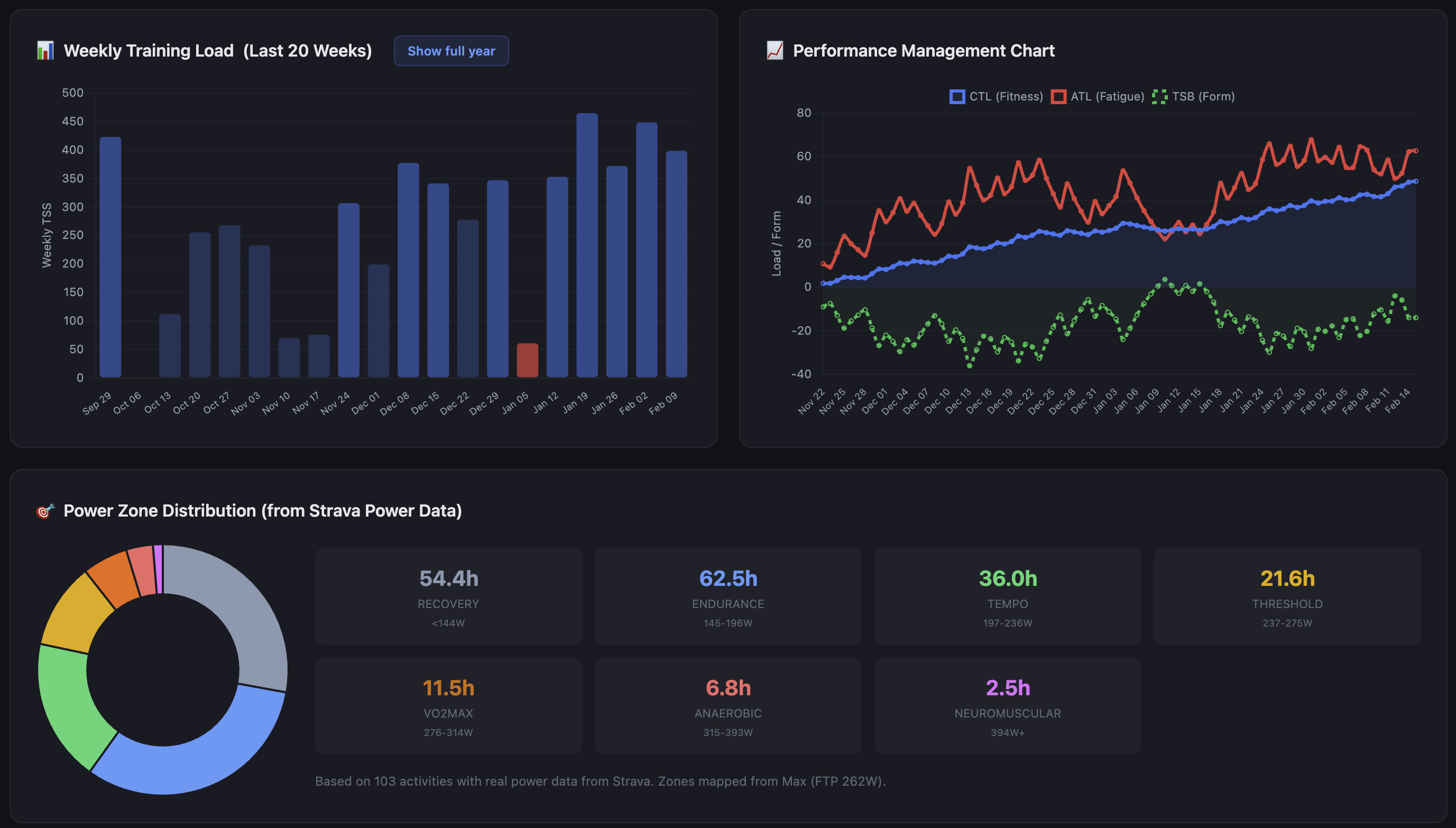
The issue isn’t any individual tool. Whoop is genuinely good at tracking recovery trends. TrainingPeaks’ PMC Performance Management Chart — models fitness and fatigue over time is still the best representation of training load I’ve found. The issue is that the meaningful signal often lives in the relationship between the numbers, not in the numbers themselves.
A TSB Training Stress Balance — form/freshness, calculated as CTL minus ATL of -25 means something different depending on whether your recovery score is 82% or 31%. A week with 90% TSS Training Stress Score — a single number measuring workout load, combining both intensity and duration completion reads differently if your HRV trend has been declining for five days. Sitting these metrics next to each other on the same day, for the same training session, changes what you do with them.
That’s the whole thesis behind the dashboard. Not to replace any of these tools, but to put them in the same room.
What it pulls together
The data sources are Whoop, TrainingPeaks, and Strava. All of it lands in PostgreSQL, synced daily via a CLI command.
| Source | Data | Sync method |
|---|---|---|
| Whoop | Recovery score, sleep, HRV, strain | OAuth2 |
| TrainingPeaks | Workouts, TSS, PMC data | Cookie token |
| Strava | Activities, power zones | OAuth2 |
The PMC Performance Management Chart — models fitness and fatigue over time is computed in-database rather than read from TrainingPeaks. TrainingPeaks doesn’t expose PMC Performance Management Chart data through its available API endpoints, so there’s no other option — but the upside is that the CTL Chronic Training Load — long-term fitness estimate, 42-day rolling average , ATL Acute Training Load — short-term fatigue estimate, 7-day rolling average , and TSB Training Stress Balance — form/freshness, calculated as CTL minus ATL numbers are mine to query and correlate directly, without hitting a UI.
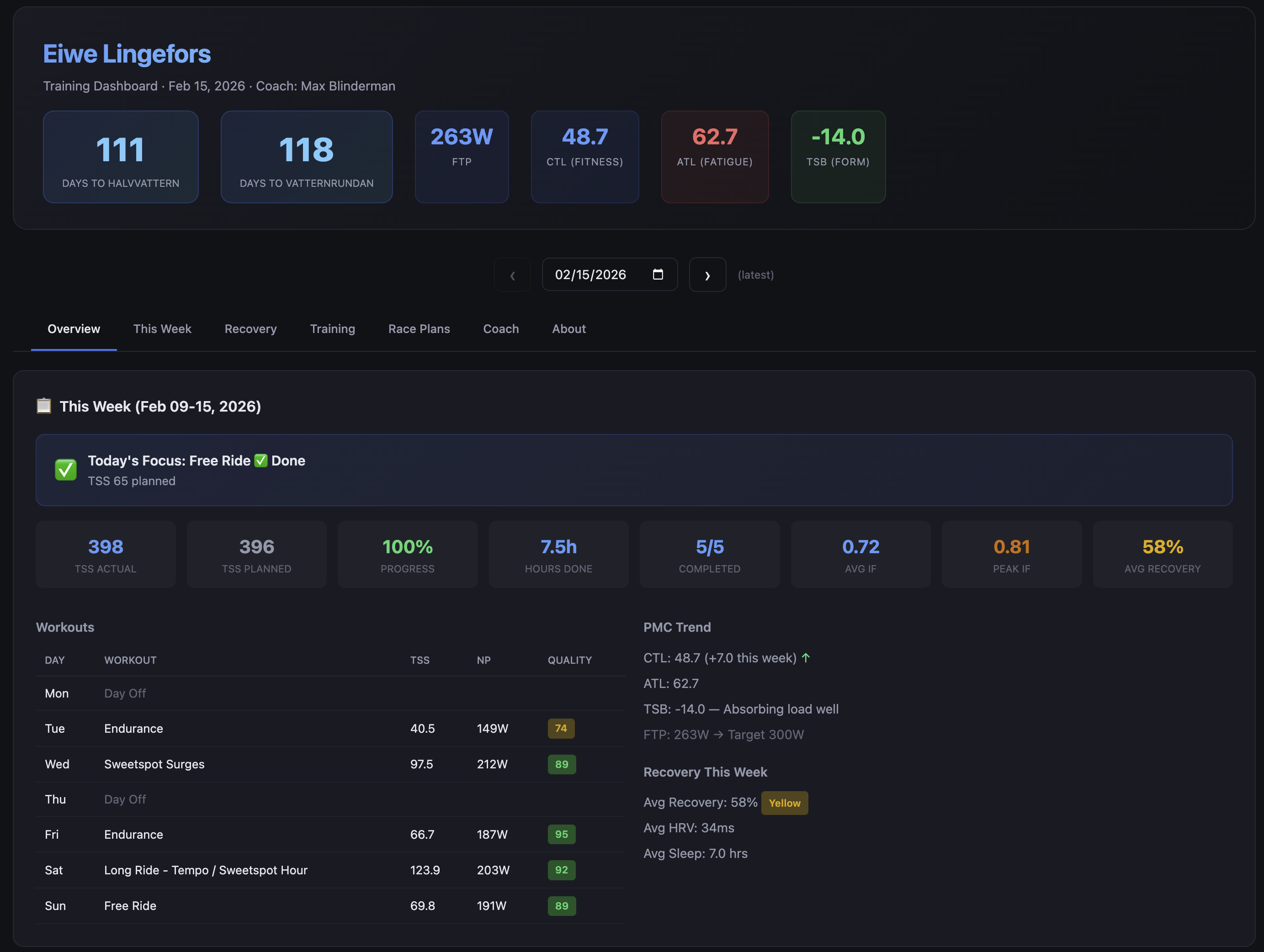
The weekly training view shows planned versus completed TSS Training Stress Score — a single number measuring workout load, combining both intensity and duration , a completion rate, and flags when the gap between the two has been widening for more than a few days. The power zone distribution from Strava sits beside the workout quality scores so you can see whether the intensity distribution matches what you actually intended to do that week.
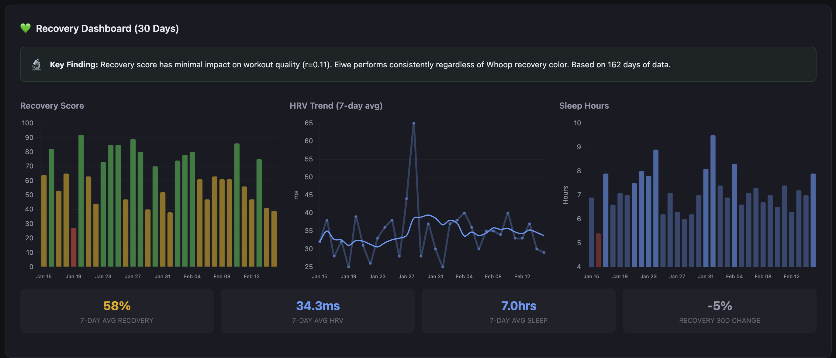
The recovery charts show Whoop data over rolling windows, overlaid with training load. The correlation is not always what you expect. There have been weeks where my recovery has stayed high through significant load, and weeks where it tanked on relatively moderate training. The dashboard surfaces those patterns; it doesn’t interpret them for you, at least not directly.
The coaching assessment
This was the feature the whole project was built around. The data aggregation, the PMC, the power zones — they all feed into this. The idea from the start was a layer of AI analysis that could synthesize everything in one place and supplement the coaching I already receive from Max. The human coach is primary; his programming drives the training. The AI layer reads the data and adds context he wouldn’t have unless I sent him a weekly report.
When the dashboard generates, it takes the last 14 days of training and recovery data and sends it to an LLM via my own API gateway. The output is a short coaching narrative, not a score, not bullet points. Prose. It reads like a message from someone who has been watching your training closely and wants to say something useful about it.
It knows about coach Max and frames observations to support the training plan rather than second-guess it. It knows the race is on the calendar and keeps the countdown in context. When I’ve had a poor completion week it doesn’t just report the number, it identifies whether the missed sessions were intensity work or volume and says something about what that means heading into the next training block.
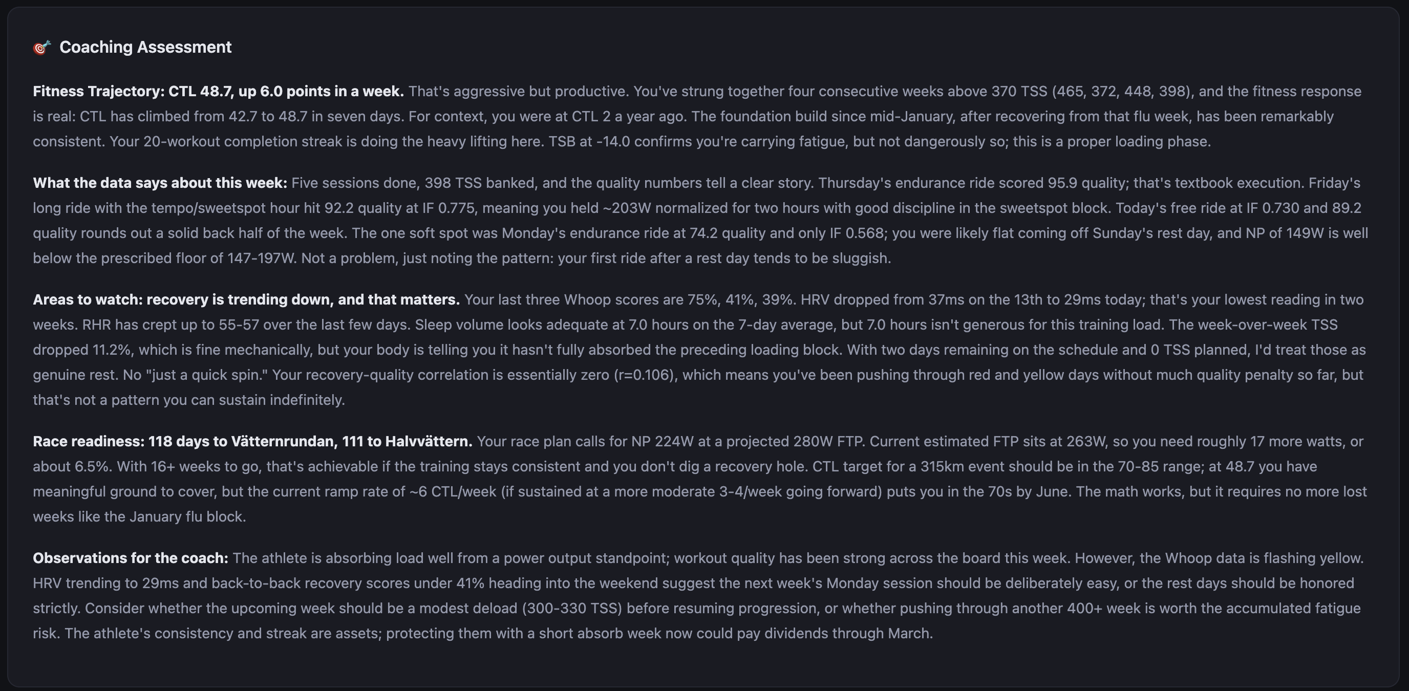
The assessment is cached against a hash of the underlying data, so it doesn’t regenerate unless something has actually changed. The provider is pluggable: you can run it against any OpenAI-compatible endpoint, fall back to a Jinja2 template if you don’t want LLM calls, or disable it entirely.
The quality of the output depends heavily on the prompt and the model. I’ve been running it on Claude Sonnet.
The race planner
Vätternrundan has a specific course profile. Known climbs, a long exposed section across Vättern that tends to produce headwinds on the return leg, rest stops at predictable intervals. The race planner module takes a GPX GPS Exchange Format — a standard file type for storing GPS route data including elevation profiles file and a set of physics parameters and produces segment-by-segment estimates.
The physics inputs are CdA Coefficient of aerodynamic drag × frontal area — the primary measure of aerodynamic resistance on the bike , rolling resistance coefficient, estimated drafting benefit, and rider plus equipment weight. The model is simple: it estimates speed from power and resistance forces for each segment given terrain and gradient, then produces a time estimate and a target power range.
The output is a structured plan: target watts per segment, estimated segment time, rest stop locations with suggested duration and nutrition targets, total estimated finish time, and a comparison between current FTP Functional Threshold Power — the highest average power you can sustain for roughly 60 minutes; the foundation metric for cycling training zones and target FTP Functional Threshold Power — the highest average power you can sustain for roughly 60 minutes; the foundation metric for cycling training zones to show the gap between where I am and what the plan requires.
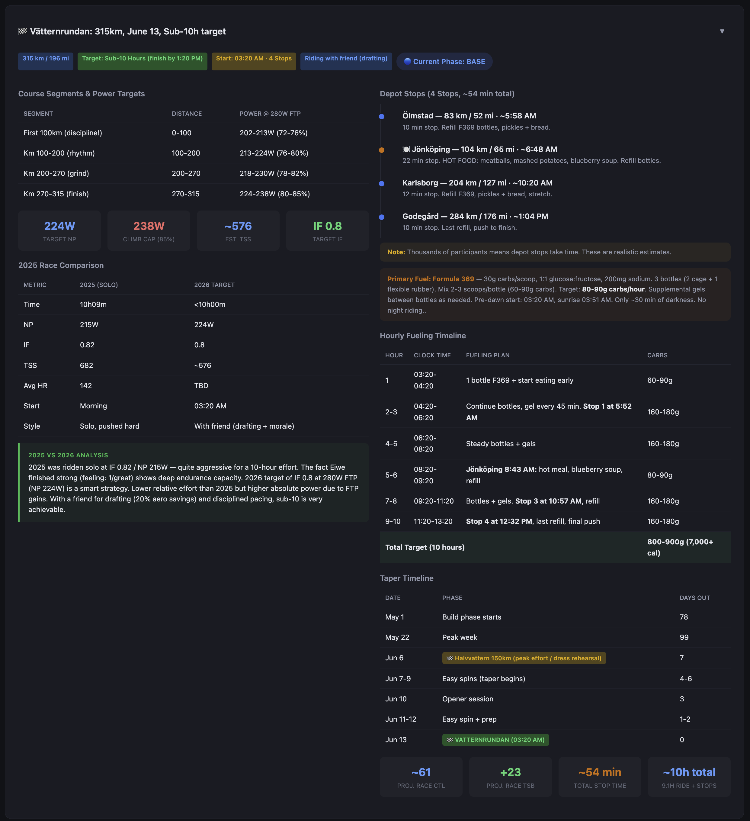
The plan also maintains phase windows: base, build, peak, taper. The dashboard always shows where in the training calendar we are, how many days to the race, and whether the current week’s planned load matches the phase.
The fitness picture
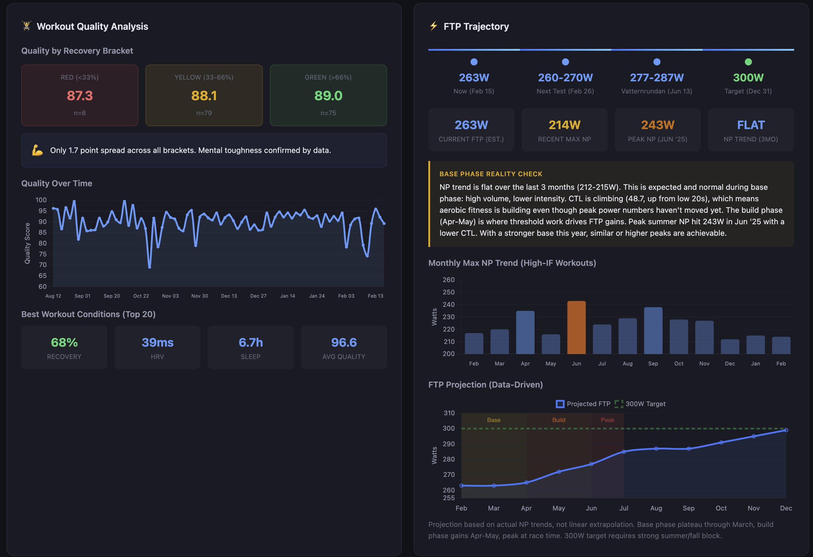
The race planner assumes a projected race FTP Functional Threshold Power — the highest average power you can sustain for roughly 60 minutes; the foundation metric for cycling training zones of 280W. Current estimated FTP Functional Threshold Power — the highest average power you can sustain for roughly 60 minutes; the foundation metric for cycling training zones is 263W. That’s a 17-watt gap with 16 weeks to Vätternrundan.
The dashboard tracks this with a data-driven projection rather than a linear extrapolation. NP Normalized Power — a variability-adjusted power average that better reflects physiological cost than simple average power trend over the last three months is flat — 212-215W. That looks like stagnation, but the base phase reality check puts it in context: high volume, lower intensity, aerobic adaptation happening underneath. CTL Chronic Training Load — long-term fitness estimate, 42-day rolling average has climbed from the low 20s to 48.7 in that same window. The fitness is accumulating; it just hasn’t translated to peak power yet because threshold work hasn’t started. That starts in April.
Peak NP Normalized Power — a variability-adjusted power average that better reflects physiological cost than simple average power last June hit 243W with a lower CTL Chronic Training Load — long-term fitness estimate, 42-day rolling average than I have now. The build phase in April-May is where threshold work drives FTP Functional Threshold Power — the highest average power you can sustain for roughly 60 minutes; the foundation metric for cycling training zones gains. The projection assumes similar or better gains off a stronger aerobic base. The 300W year-end target — the one on the calendar for December 31 — requires a strong summer and fall block after the race. Vätternrundan is a waypoint.
One finding from the workout quality analysis changed how I interpret all of this: the quality score spread between red, yellow, and green Whoop recovery days is 1.7 points. 87.3 on red days, 89.0 on green, across 162 workouts. The recovery-quality correlation is essentially zero (r=0.11). That doesn’t mean recovery doesn’t matter — the coaching assessment regularly flags HRV trends and what they mean for the next training block. What it means is that how I feel in the morning is a poor predictor of how I’ll perform on the bike. The dashboard now shows that correlation explicitly rather than letting me assume one exists.
How it got here
v1The first version was a Python script that called the Whoop API and printed a recovery summary to the terminal. That was the entire thing.
v2The second version added a TrainingPeaks sync and an HTML file with inline styles. It worked well enough to be useful, which is why it grew.
What it grew into was a monolith. One large script doing everything: API calls, database writes, analysis, HTML generation, upload. It was fast to iterate on and genuinely difficult to reason about after a few months.
currentThe current version is a proper CLI with modular data source adapters, a Jinja2 templating layer for the dashboard, a coaching assessment module with pluggable providers, and two upload backends (Vercel for static hosting and WebDAV for direct server upload). The PMC Performance Management Chart — models fitness and fatigue over time and correlation analysis run as SQL queries against the local database rather than being computed in Python on every run.
The project is currently in the middle of a second significant refactor. PR #39 is open and covers the cutover from the proof-of-concept structure to a cleaner modular layout where data sources, analysis modules, and output backends are genuinely separable. The goal is to reach a state where someone else could configure the tool for their own setup without needing to understand the entire codebase.
That’s not where it is today.
Where it lives
Work in progress
The repo is at github.com/auriwren/cycling-training. It’s public and MIT licensed.
A few things worth being direct about: this is a personal tool in active development, not a product. The documentation covers the current architecture but is incomplete in places. The init wizard exists and generates a valid config, but some options require manual editing. There are known rough edges. The modular refactor is unfinished.
If you’re a technically comfortable cyclist who’s comfortable with Python, PostgreSQL, and reading code that isn’t finished, the bones are there and it mostly works. If you want something polished and ready to run out of the box, this isn’t it yet.
I’ll keep building it either way.